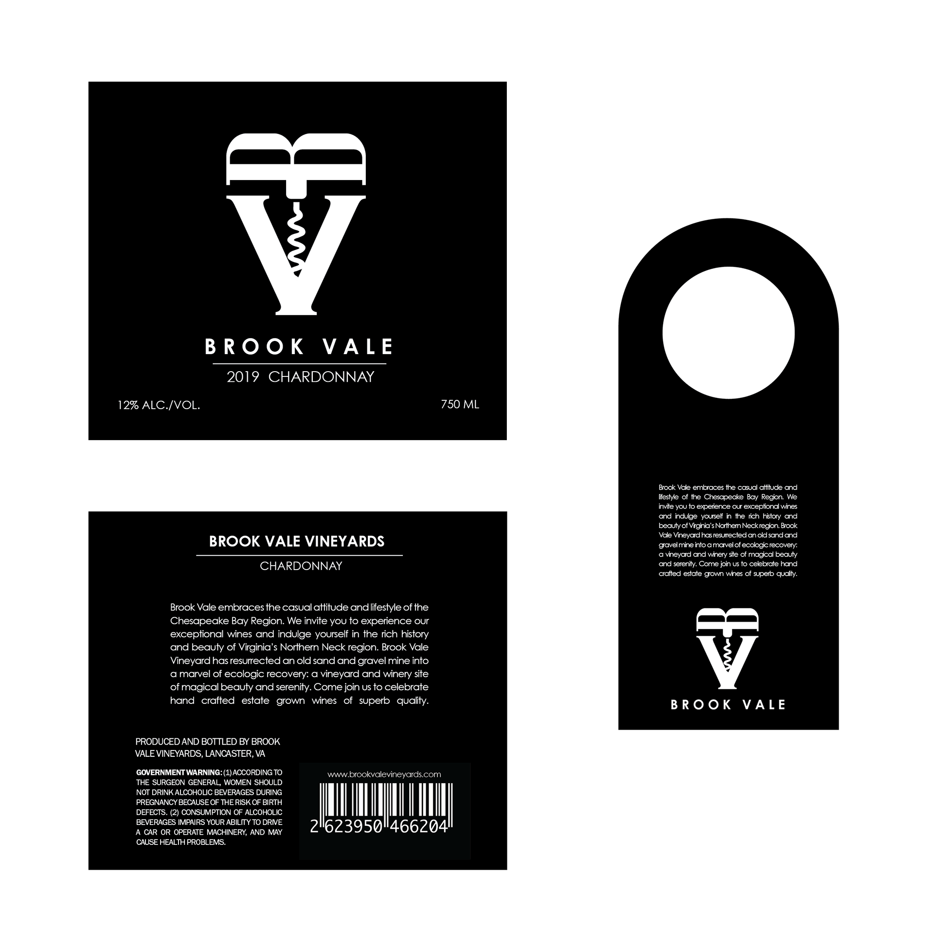
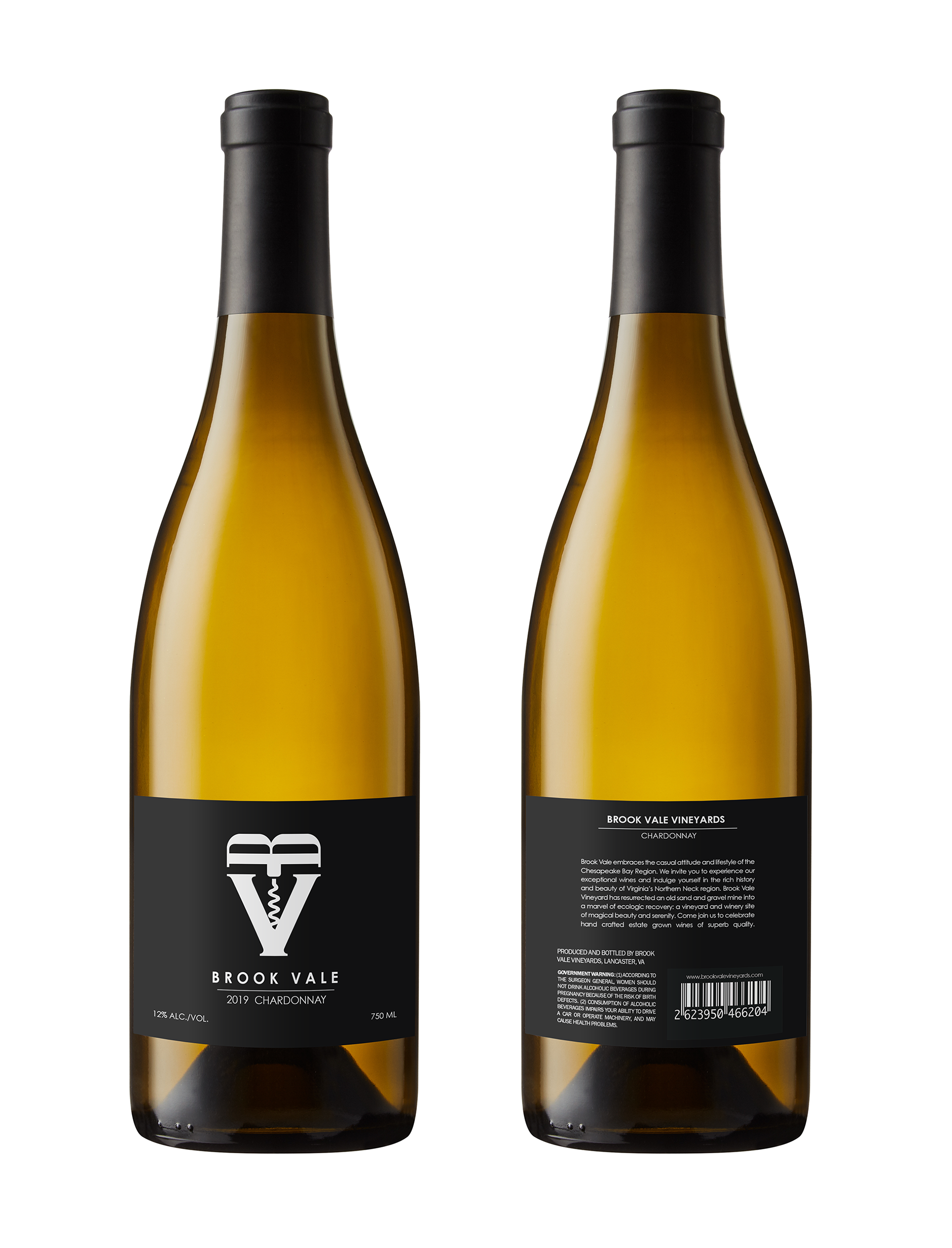
I was tasked with designing the brand identity for a chardonnay wine company, ‘Brook Vale’. After many iterations, the fully realized company brand was distilled to a sleek, sophisticated signature and applied to wine bottle labels along with a bottle neck hang tag.
Brook Vale embraces the casual attitude and lifestyle of the Chesapeake Bay region. We invite you to experience our exceptional wines and indulge yourself in the rich history and beauty of Virginia’s Northern Neck region. Brook Vale Vineyard has resurrected an old sand and gravel mine into a marvel of ecological recovery: a vineyard and winery site of magical beauty and serenity. Come join us to celebrate hand crafted estate grown wines of superb quality.
I decided to make typography the focus for this brand, with the goal of developing a distinct voice and iconography. After experimenting with monogram treatments for the ‘Brooke Vale’ title, the idea came about of making the letter “B” a corkscrew splitting the letter “V,” signifying a new beginning, a celebration marked by the opening of a new wine bottle. The color palette is subdued to only black and white to convey sophistication and to focus attention on the striking arrangement and meaning of the logo mark. Although not intentional, a heart shape became visible in the outline of the logo mark to some members during review rounds, a pleasant coincidence I later embraced for this brand and aided in solidifying its visual identity. This finalized branding was then applied to the collateral, a hangtag meant to adorn the neck of the wine bottle and provide a description of Brook Vale’s history.
All photos and mockups used under Fair Use for educational purposes.

